

the Trendy color palettes of 2021
2021 had some pretty popular color trends with balloons and one definitely stuck out to us.
You know… color has a lot of history: and I’d like to begin this blog post discussing the history of color and tell you all a story about my life and how much color has impacted my life over the years.
Can you remember the first color you ever saw? Can you remember the first time you ever were able to identify a color? How did you learn that RED was in fact red? Did a toy tell you? Did a parent tell you? Now of course, I can’t remember the first color I ever saw, or the first toy that I ever had that even told me colors… but I do remember the bucket that had the shapes on the top and putting the colorful shapes inside of that bucket… and how those shapes, simply, shaped me.
The square: “What does a square say about me?” I would say to myself as I would attempt to slam the square block into that star shaped hole.
Okay, no no no, I’m not going to really do that…
I just really wanted to be one of those bloggers for a minute when you click to see a recipe on pinterest and it’s just ADS everywhere and their entire life freaking story for the first SEVEN SECONDS OF SCROLLING before you get to the INGREDIENTS list… and sometimes there’s that like, fakeout list that shows up first and that list is just LINKS that LOOKS like it could be the ingredients list… and if you click on one of those OH NO: now you’re redirected somewhere else and now I’m PISSED because I’ve lost the recipe I wanted…
Let’s talk about the color trends of 2021 now
Jess and I usually notice the trends pretty early into the ‘latest’ trend because we’ll look at a handful of events that are booked within a month of each other and realize: “oh hey - these FIVE events have exactly the same color palette”
So let’s talk about it - what was popular this year? The Pantone of 2021 was yellow and grey… but surprisingly we only had one request with that palette all year long.
You might already know the answer if you follow our social media or are someone who actually follows decor trends (and I don’t just mean balloons)
What did you notice being the common color with all of these? Or a common color palette overall?
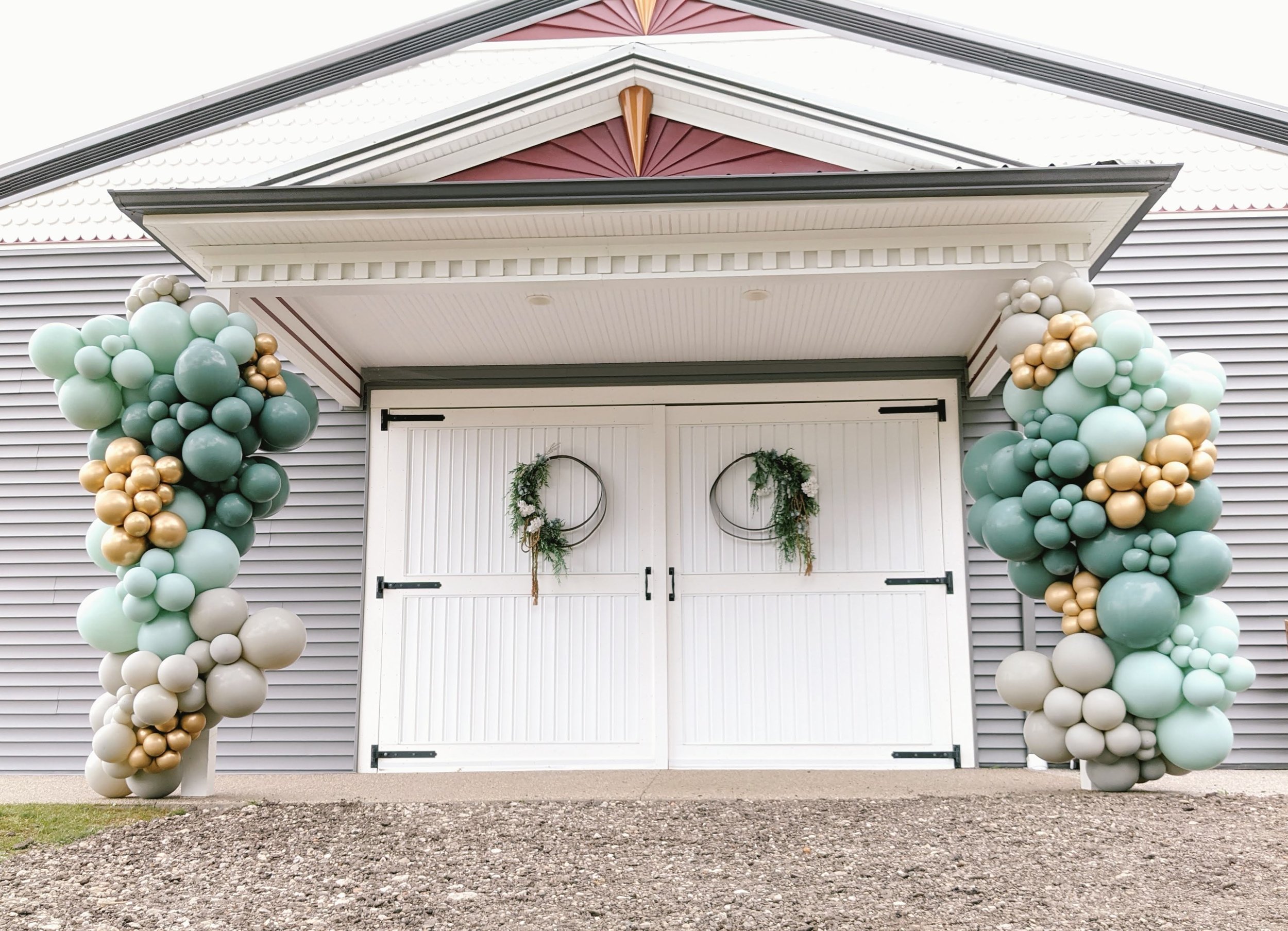
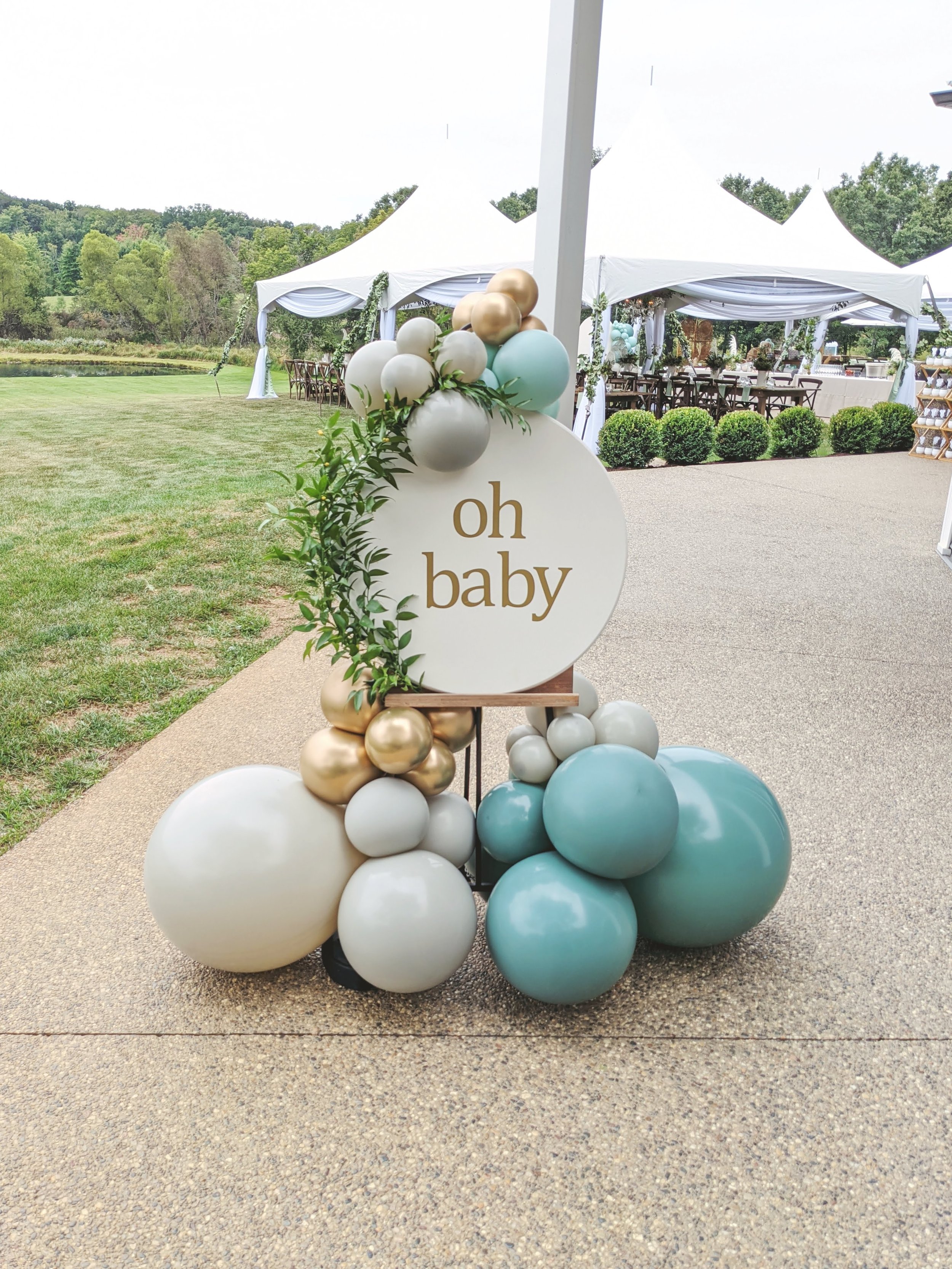
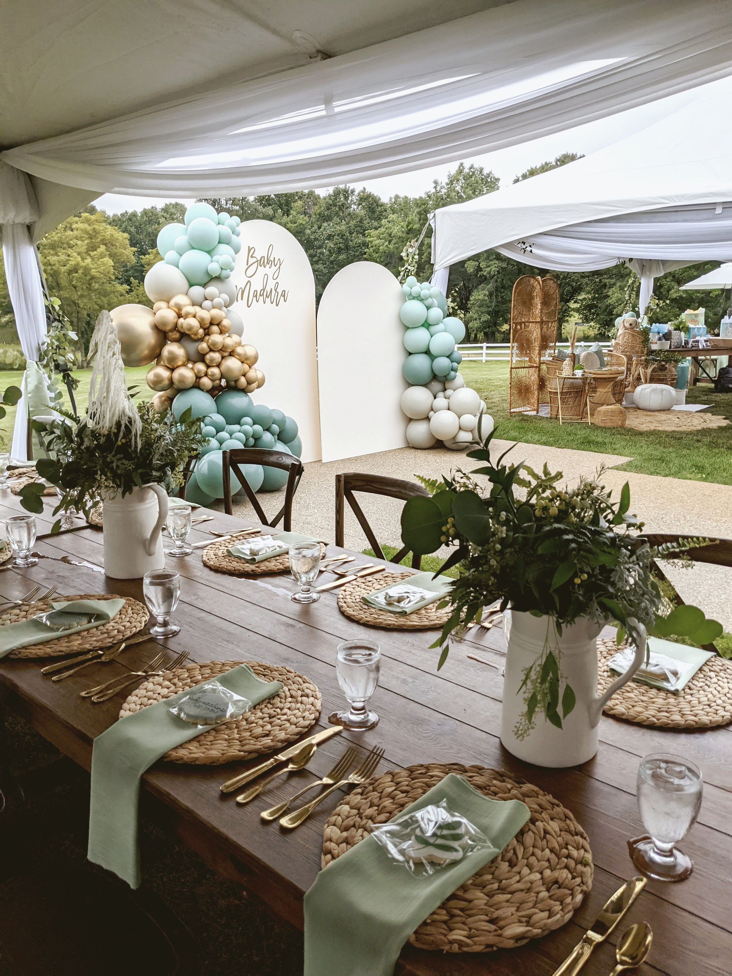
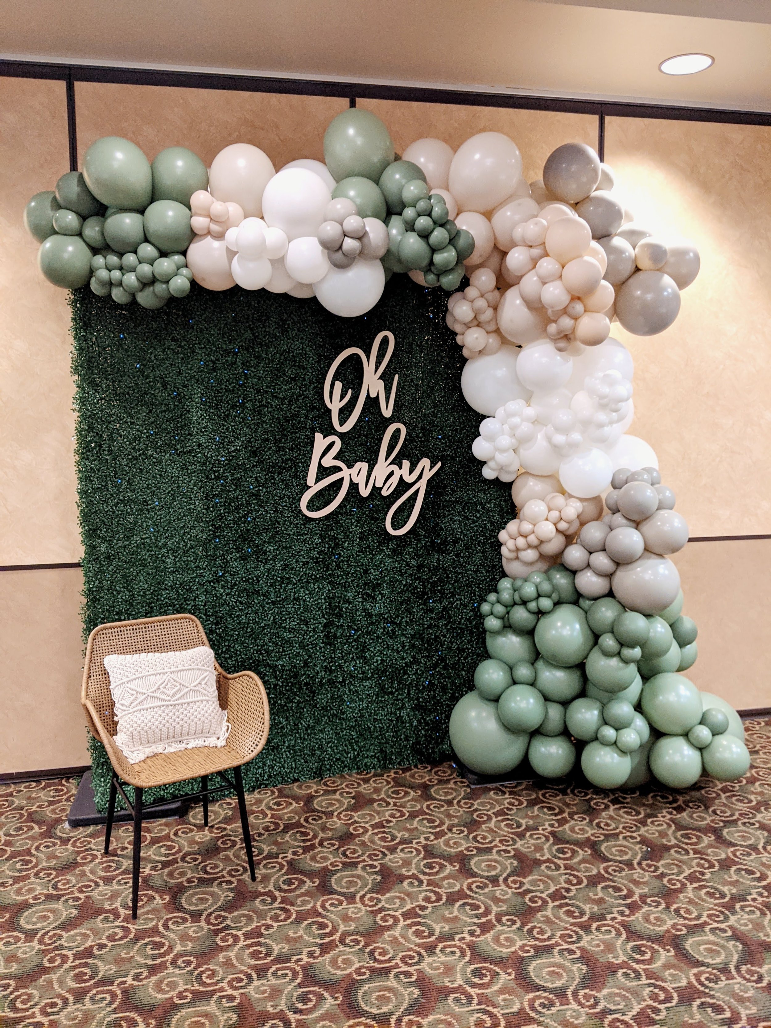
The big trend this year for us was definitely along the sage green/mint green route usually incorporating chrome gold or metallic gold and a neutral taupe color like Stone from Tuftex or White Sand from Betallic.
There are two sage greens that we use
The first sage green is a Tuftex color that is newer-ish known as Willow. It has more of a blue-ish tone and I personally like it the most. Not only because my favorite colors are on the ‘cooler’ side of things and I tend to love blues, but Willow comes in a lot of different sizes: this is really helpful when we’re building an organic design. We usually suggest putting Willow with Empowermint (which is the mintier green, also a Tuftex color)
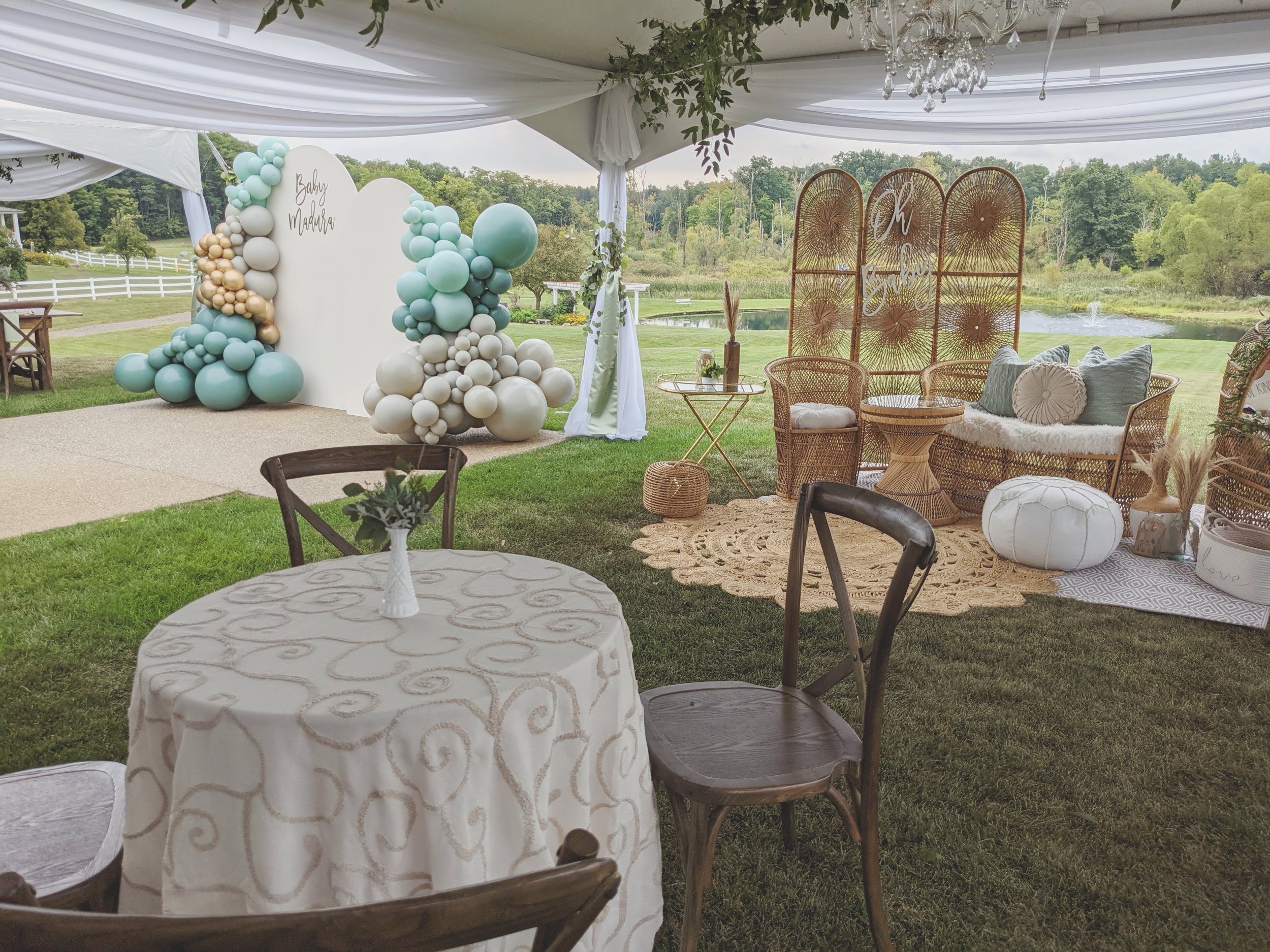
The designs below all used Willow for their sage green. The organic columns at the Oakley in Holly and the White Bounce house both also have Empowermint incorporated into them.
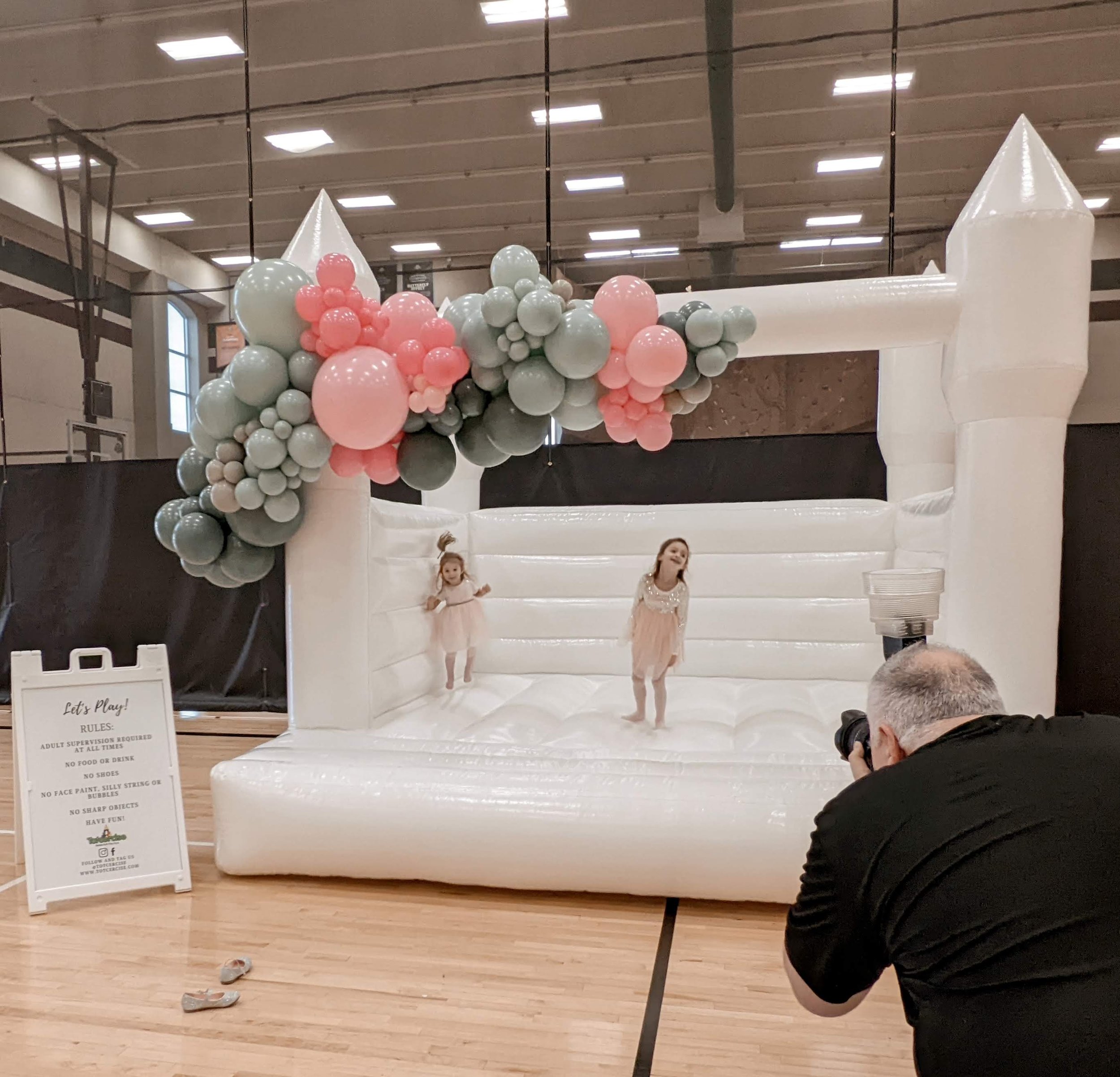
The white bounce house was a collab with Totcercise in Commerce for Amina’s fifth birthday party. The colors on the white bounce house balloon garland are: empowermint, sage, baby pink, rose pink, and stone.
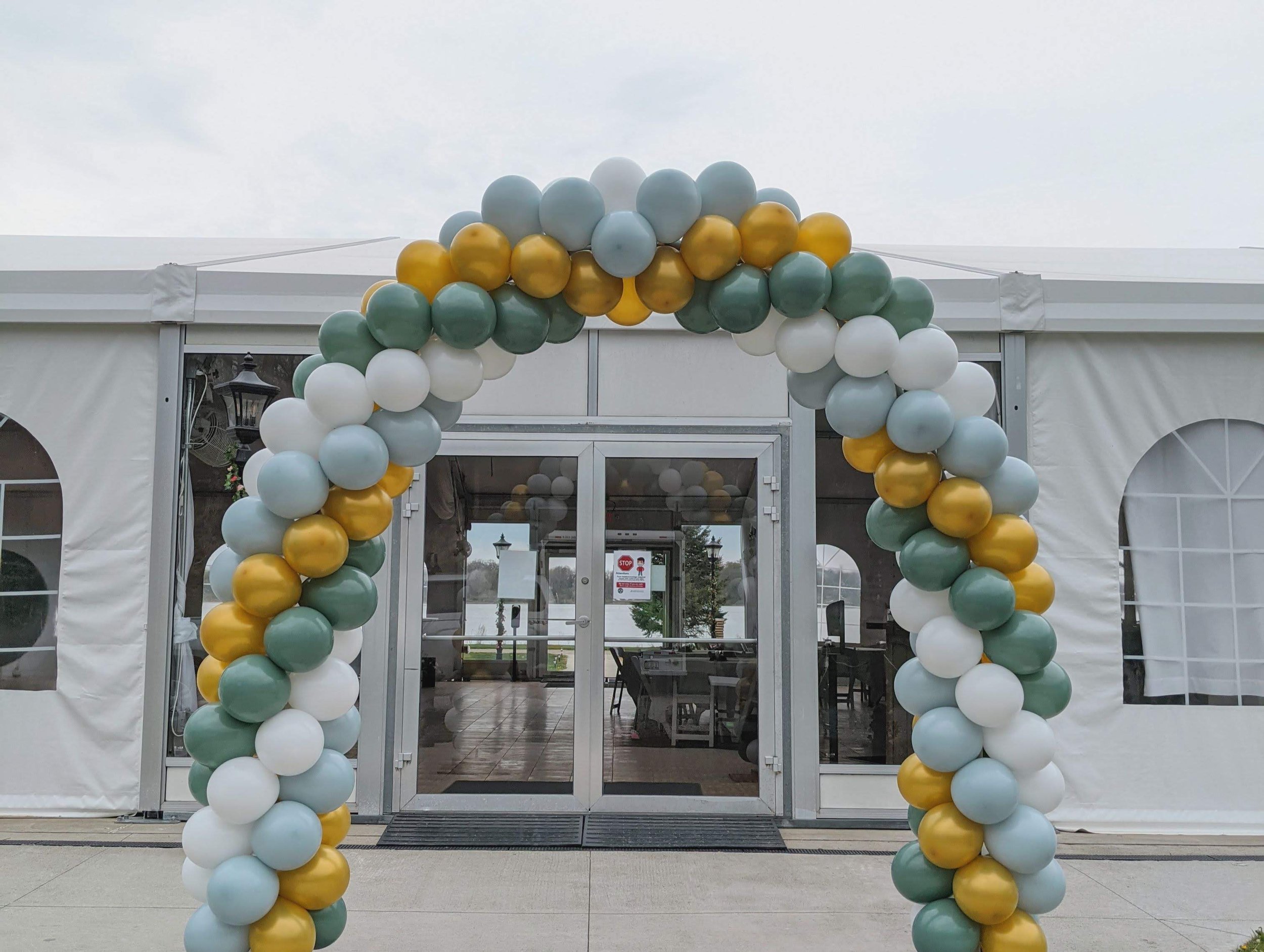
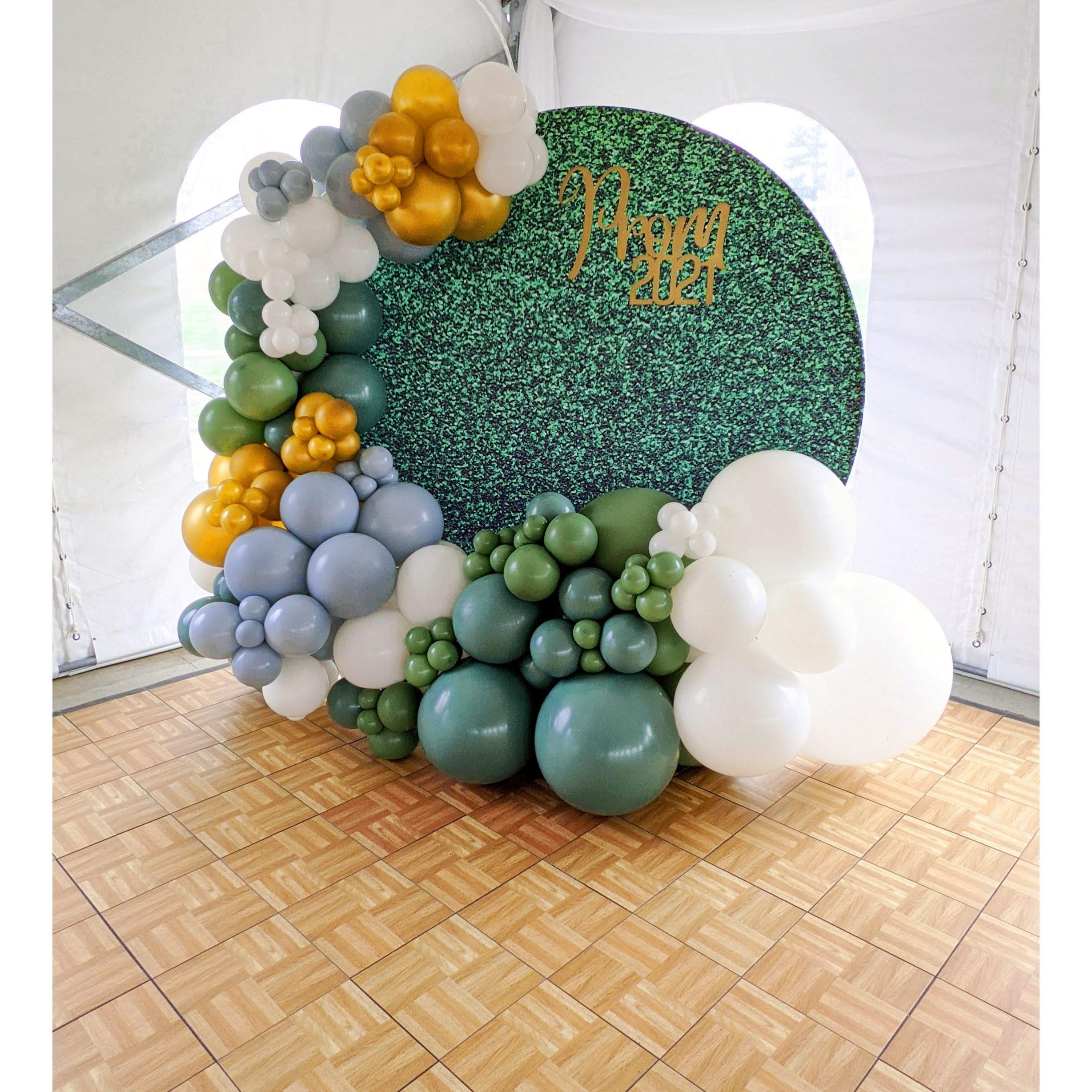
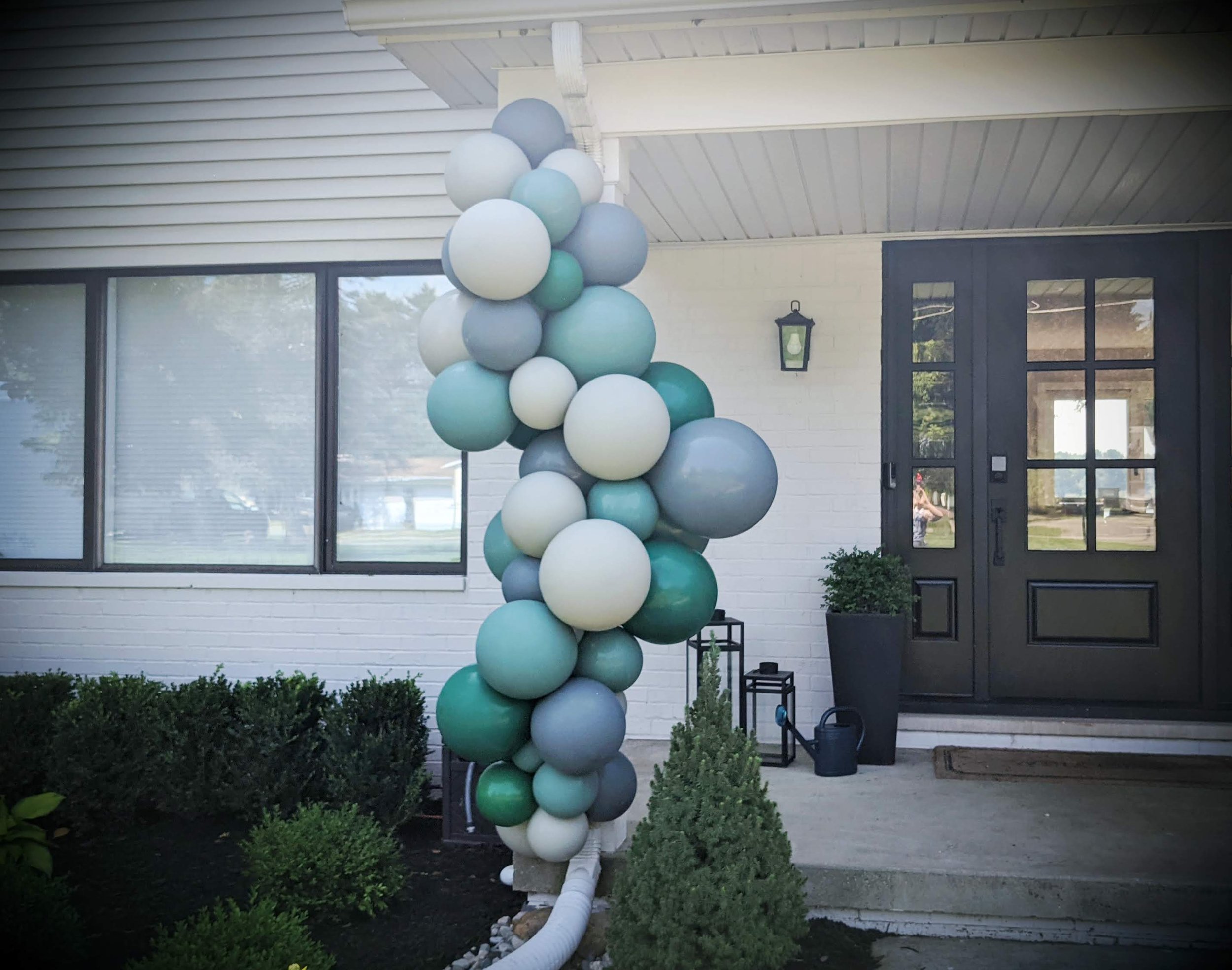
The reverse spiral arch was for Howell High School’s Prom at Waldenwoods in Hartland, MI. The colors in this arch are simply white, fog, willow, and metallic gold.
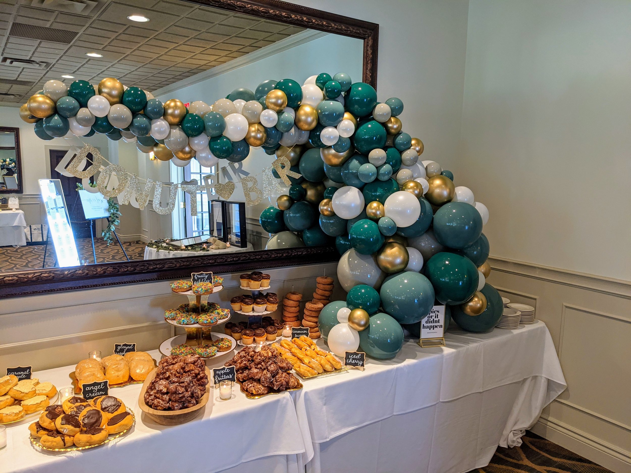
The organic columns and the chiara backdrop colors at the Oakely in Holly were created for Morgan’s baby shower. The colors we used here were stone, empowermint, willow, and chrome gold. (it’s a great side by side for metallic gold and chrome gold)
The other sage green that we use is by Betallic and is known as Eucalyptus. It’s a color that has been around for some time now, and if you google “Sage Green Balloons” it is the color that will pull up on the interwebs (especially on Amazon)
Jess is a fan of this color more than I am, and tries to make an excuse for us to use it whenever possible. It has more of an earthy, camo green, and picks up more of the brown/yellow hues. But that isn’t why I don’t personally care for it: it’s more about the fact that it comes in limited sizes.
There’s a size that we use a LOT when we are building our organic garlands and Eucalyptus does not get made in this size (nor do any betallic colors and I find it really annoying) And because of this: eucalyptus has to typically be a piggy-back color for the palette. We have to be really creative about our placement, or do a color-mix instead of a color chunking/color blocking when we build. Check out some eucalyptus “and all of her glory” (as Jess would say) below:

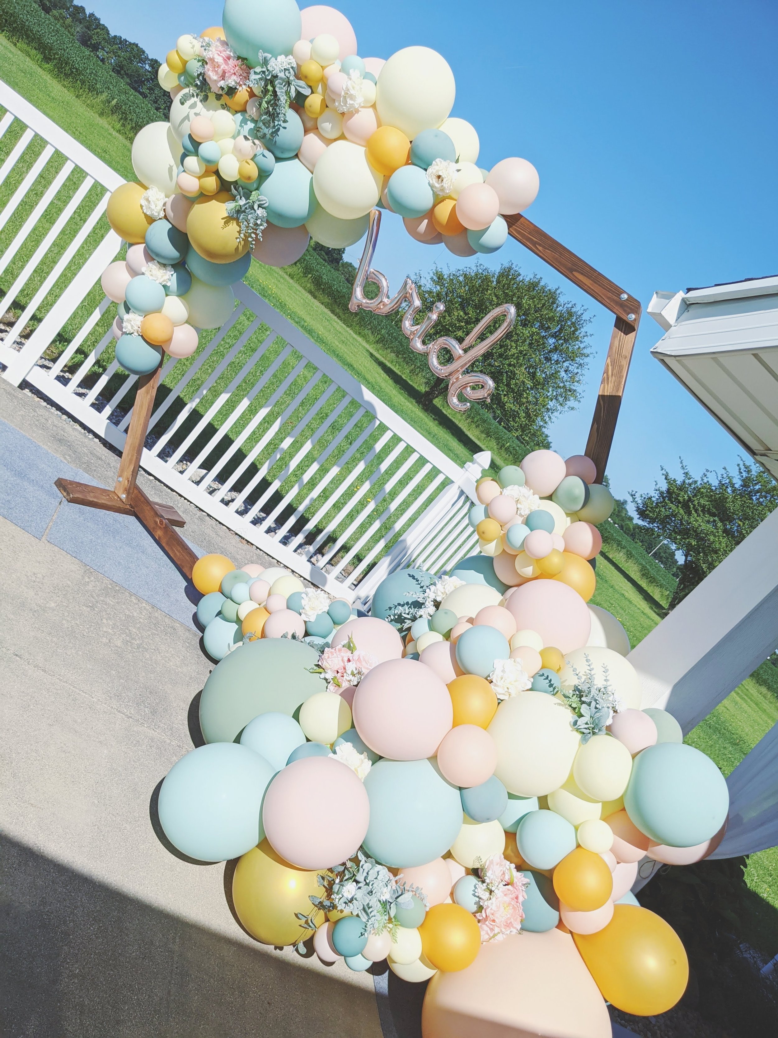
The Hexagon Arch out in Eaton Rapids was a decoration for a couple getting married and their wedding shower. I actually bought the hexagon off of the couple after their wedding because I fell in LOVE with it when I built on it. Autumn was the bride and her husband Erik built the frame for their wedding shower and their altar. The colors in this piece were eucalyptus, willow, empowermint, metallic gold, pearl peach, cameo, and ivory. (But it looked elegant AF, amirite?)
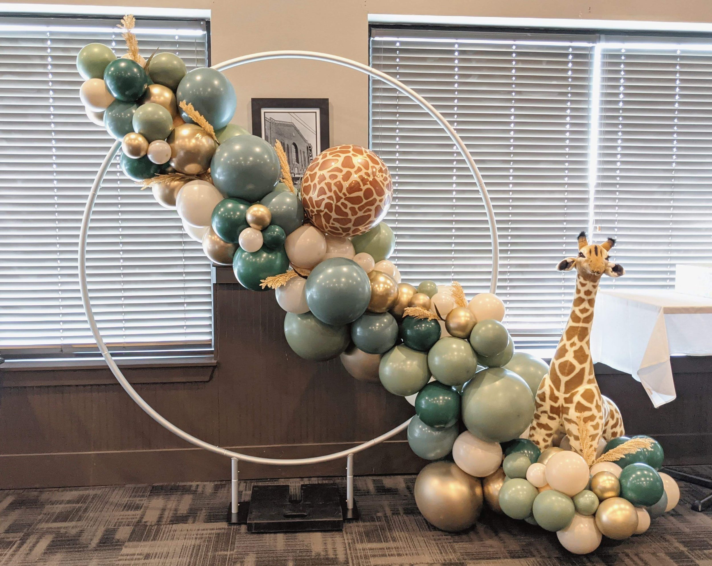
The circle frame with the giraffe was for Danielle’s baby shower in Rochester Hills. Her colors were eucalyptus, willow, evergreen, chrome gold, and qualatex blush. I used to actually work with Danielle back in “the old days” of my career working in Audiology. She works as an audiologist in my old clinic and I was so excited to build for her. I personally love this palette when anyone asks for a “jungle theme” verses the “cartoony jungle” with the lime greens/spring greens and bright orange and goldenrod. Yah: that’s right: I’m onto this trend here. *gasp*
The boxwood arch was for Chantel’s baby shower in Grand Blanc and made with some pretty strict guidelines - the mom did not want any blue hues at all, wanted a LOT of eucalpytus & white sand, and not a lot of empowermint or stone: so this created a bit of a challenge for Jess (she built this one solo) So it’s constructed of eucalyptus, stone, white sand (another betallic color that has limited sizing), white, and empowermint. The lighting in the hall was very orange, so the color tinting of the photo makes the eucalyptus look very minty. You honestly can’t even seen the empowermint in it. Sometimes we need to be trusted… and well, Jess did great with the cards and demands she was handed.
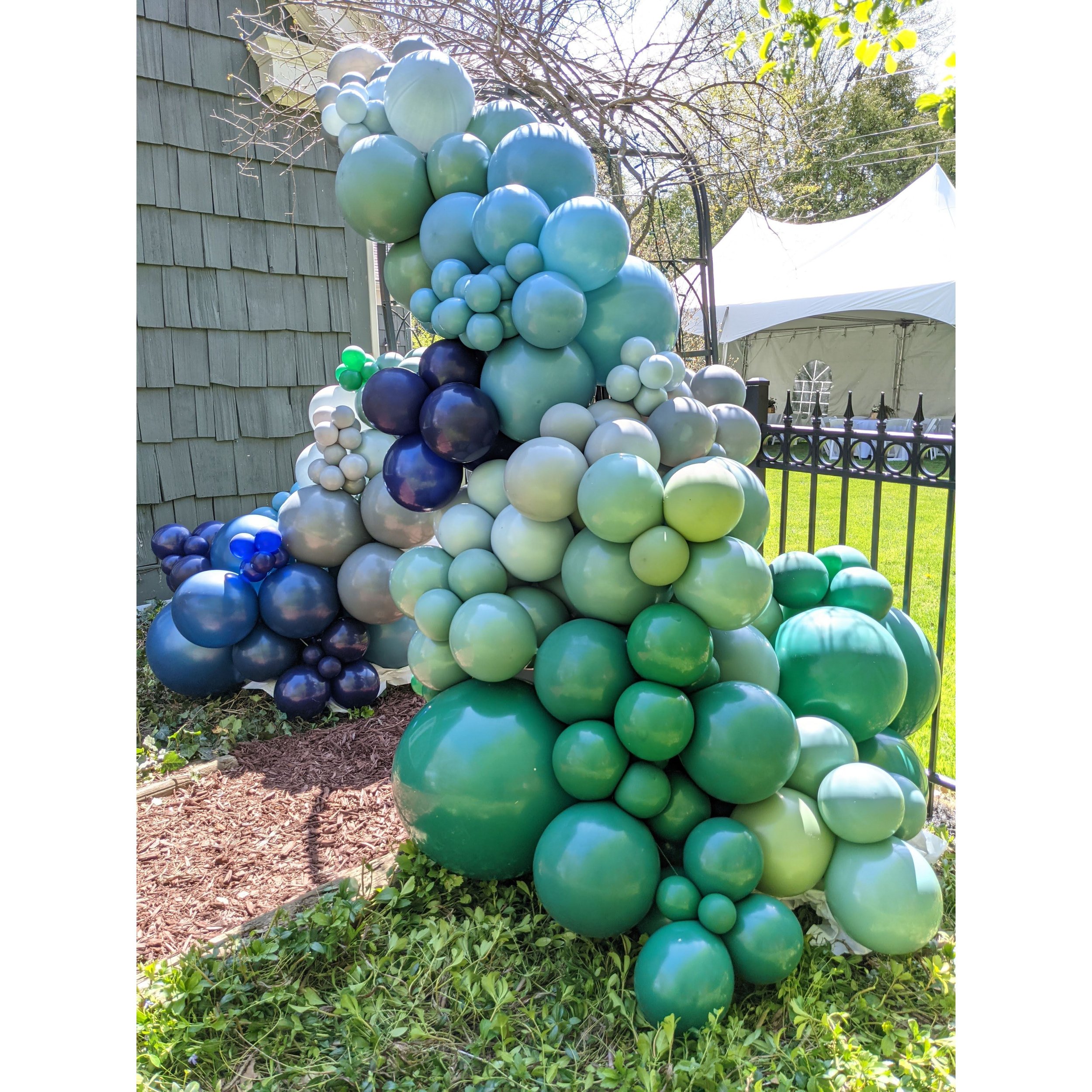
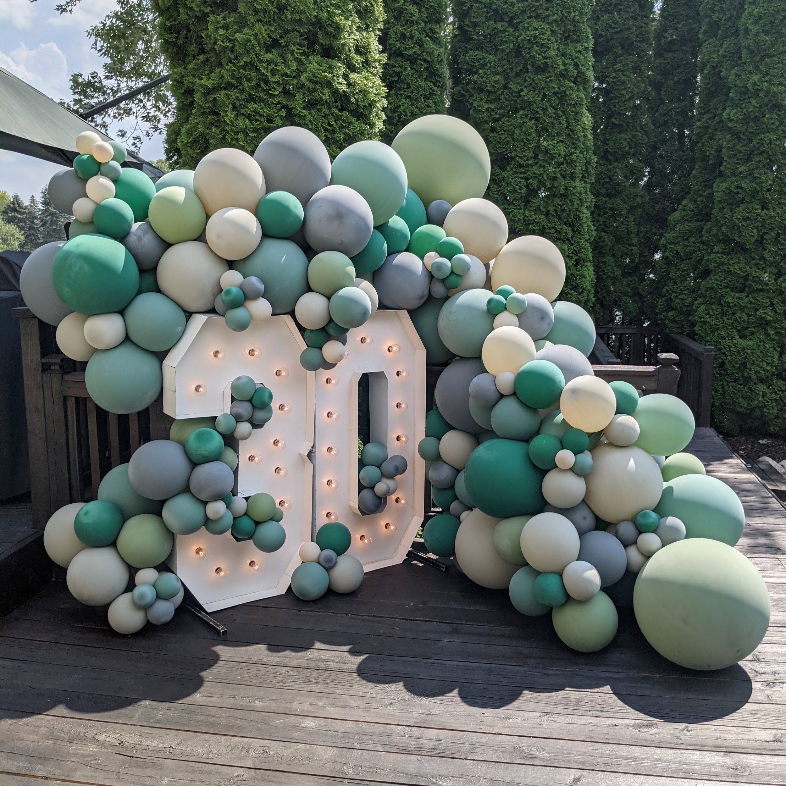
The marquee numbers were made for Allison’s husband Cal for his surprise 30th birthday out in Goodrich. It was THE HOTTEST day ever and Jess and I did think we were going to die during this installation. lol. I believe it was like 98 degrees and super humid: I was worried the balloons wouldn’t make it to party time. But I got tons of photos from Alison that evening and they looked glorious still: hours after we left and into the evening. We built that piece with eucalyptus, willow, evergreen, smoke, and stone. (And I ended up coming with Jess at the very last minute: she was going to do this installation solo originally but I had a client cancel on me the very last minute, so I hopped up to Goodrich to help Jess that day… and boy oh boy am I glad that I did because I am pretty sure if we weren’t there pushing each other to keep working and actively drinking water that one of us would have passed out and died from heat stroke)
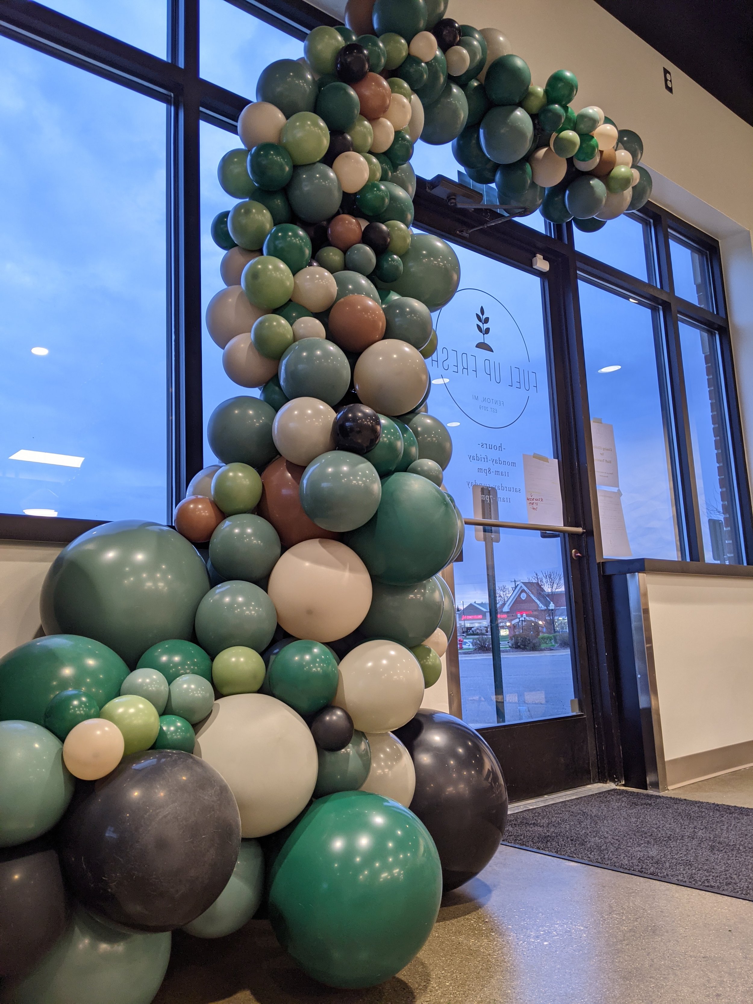
Another solo build for Jess was the Fuel Up Fresh arch in Fenton. They opened their storefront in April and were so excited to ask us to build a grand opening arch for us in earthy tones. Jess built this one with eucalyptus, evergreen, white sand, black, and mocha.
Final statement: 2021’s top color palette choice by our clients was definitely Sage Green, and the color palette was a “Muted Neutral Sage Green with a pop of another color”
(if people would listen to us)
I would also like to point out that Jess was on almost EVERY one of these installations, and many of them she was either solo or head honcho with me being the ‘assist’ (yeah: sometimes I let Jess and Thomas run the show (or I let them think they are))
It got to a point in 2021 that whenever I’d tell Jess that she had a new job on her calendar… I’d text her and say “The color palette for the job is… wait… willow… stone… gold… aaaand”
And she’d tell me that she was going to kill me if I said empower-mint. lol.
BUT she really likes greens: she secretely LOVED 2021. (so don’t let her fool you)
What do you think? Do you have a favorite that we did this year? Do you love the sage green/neutral muted palette? Or are you more bold?